November 7, 2018, 4:34 am
Full-Grid Searching in Angular Data GridAdds inline editing, sorting, filtering, grouping, searching, multi-column headers to Angular Grid.
Features
- Create Microsoft Excel Dashboards with .NET & JavaScript - Create engaging Microsoft Excel dashboards and user-friendly reports with charts and sparklines in your next JavaScript, Windows Forms, or WPF application - all without needing Excel on the client machine.
- Display and Edit Hierarchical Data with the Angular TreeGrid - The new Angular Tree Grid is a powerful data shaping component that allows you to display and edit multi-column hierarchical data with sorting, filtering, column pinning, column moving, column hiding, paging, and more.
- Powerful UI Interactions with the Angular Grid - Give your end-users the power of real-time data interactivity with features such as inline editing, sorting, filtering, grouping, searching, multi-column headers, and much more.
- Best-of-Breed Charts for Financial Services - Exclude custom ranges with scale breaks, focus your data with crosshairs and custom tooltips, annotate important data with callouts, bring focus to the last data point in your data source with Final values, and more in your financial applications.
- Angular Tooling to Increase your Development Productivity - Write Angular apps faster with productivity tools from Infragistics. Use the Ignite UI Toolbox to generate code, install npm packages, and update modules with the click of a mouse. Learn control APIs with the help of Ignite UI Tooltips and scaffold your entire app straight from the command line with the Ignite UI CLI.
↧
November 7, 2018, 7:17 am
Aspose.Tasks for JavaRead activity codes in XER files.
Features
- Read activity codes in XER files. (XER is a Primavera P6 Project File).
- Add recurring task parameter validation when creating a recurring task.
Fixes
- Incorrect scheduling of recurring daily task.
- Wrong timephased data for material resource.
- Fixed issues with formula calculation.
- Loading MPP file raises Exception.
- Custom field values are not formatted properly when saving a project to PDF.
- Incorrect start of recurring task.
- Aspose.Tasks throws exception when trying loading document in few threads.
- Problems Loading MPP with project summary (Project 2016).
- Wrong number of task links after export.
- Unsupported comma in task summary while exporting to MPX format.
↧
↧
November 9, 2018, 2:52 am
New Sunburst ControlNew Sunburst chart lets you visualize hierarchical data in an elegant and compact manner.
Features
New Sunburst Control
- This release includes a new WinForms Sunburst Control - designed to visualize hierarchical data in an elegant and compact manner. Its features include:
- Ability to represent hierarchical data sets and flat data tables
- Built-in coloring algorithms
- Advanced highlight behaviors
- Tooltip support
Charting
- Pane Layout Enhancements - You can now add an individual title for each pane and hide a pane by clicking its title. Panes can be displayed using a grid layout.
- Drill Down Chart - The WinForms Chart Control now supports nested Series Templates - allowing you to implement drill-down enabled charts with ease. You can create endless drill-down levels and use the control's integrated Breadcrumb navigation option to move across your data hierarchy.
- Performance and Memory Usage Improvements - This release includes improved performance and memory consumption when displaying a large number of data points.
- Zooming and Scrolling Enhancements - The WinForms and WPF Chart controls now support keyboard navigation. New settings allow you to configure hotkeys. Hotkeys can also be used to affect the behavior of mouse buttons when zooming in/out or zooming to a rectangle. With this release, end-users can zoom a specific axis element using the mouse wheel when the mouse pointer hovers over an axis label.
- Crosshair Label Can Display Indicators - The Chart Control's Crosshair Cursor can now display Technical Indicators. It also extends the Indicator's API and made it similar to the Series API. All settings available for a series are now available for an indicator.
Data Grid
- Find Panel - Search Mode - The Grid's Find Panel ships with a new Search mode. When used, search results are highlighted within the view and scrollbar.
- Scrollbar Annotations - Inspired by Visual Studio, the WinForms Grid Control now supports scrollbar annotations - colored markers arranged along the vertical scrollbar.
- Excel-inspired Group Filters - Excel-inspired group filters were first introduced in May 2018 for the WinForms Pivot Grid and TreeList controls. This update addsthis capability to the WinForms Grid control. Filter dropdowns can now group filter items from two or more columns, and present results as a hierarchical checked list.
Diagram
- Pan and Zoom Window - You can now pan and zoom by using the Diagram Control's Pan and Zoom window. The blue box indicates the region of the page that is shown in the drawing window. Resize the blue box by dragging a side until it fits the area that you wish to magnify. To pan the diagram, drag the blue box over the section you want to view.
- Splitting the RightAngle Connector - When the DevExpress Diagram Control calculates routes for RightAngle connectors, it tries to find the closest route from start to finish. This can result in overlaps when multiple connectors originate from the same point. Many of you have asked us to deliver an alternative solution to help reduce confusion. In v18.2, the Diagram Control allows you to split connectors and define the minimum acceptable distance between them.
- Diagram Viewer - With this release, you can switch to "view only" mode and disable all operations that can affect the diagram itself. New options allow you to define which operations are allowed and hide the rest.
- Item Selection Modes - The Diagram Control's selection modes now include:
- None - Item selection is disabled.
- Single - Only one item can be selected.
- Multiple - Multiple items can be selected/deselected via the mouse.
Editors
- Calendar Control - New Fluent View - The new FluentUI View for the Calendar Control supports Acrylic and Reveal Highlight effects and allows you to mirror the appearance of the Windows 10 calendar.
- CheckEdit - New SVG Check Styles - CheckEdit check styles have been extended. New SVG check styles are more attractive and support all the benefits that come with the use of vector-based icons (scaling without quality loss, automatic color adaptation based on the current skin and palette).
- Filtering UI Context Enhancements
- The ResetBinding/ResetBindings methods allow you to manually refresh editor values.
- The AddField method allows you to add custom editors bound to desired data model fields.
- Items can be customized in Filtering Events via the WithDataItems method. For instance, you can now assign custom HTML Text to display item images.
Navigation UI
- Office Navigation Bar - Tab Navigation View - With this release, you can easily create tab navigation options like those found in Microsoft Outlook and Visual Studio – user experiences with a modern appearance and borderless tab headers.
- NavBar to Accordion Converter - The DevExpress WinForms Accordion control extends the capabilities found in the NavBar control. If you are still using the NavBar control and want to replace it with the Accordion while preserving customization settings and paint styles, click the 'Convert to AccordionControl' smart tag. Note that event handlers are not converted. You will need to handle all item interaction events manually.
PDF Viewer
- DirectX Rendering - DirectX rendering was first introduced in May 2018 as a community technology preview (CTP). This update marks its official release. DirectX Rendering is now used as the default rendering engine.
Pivot Grid
- Unbound OLAP Fields - You can assign an OLAP Multidimensional Expression (MDX) to a PivotGrid field and create an Unbound Field for OLAP. You can also use the OLAPQueryData event to obtain an MDX query (used by the pivot grid to request data).
- Performance Enhancements - The Pivot Grid's in-memory data processing engine and now support the following features in Optimized Mode:
- Custom Types
- Custom Totals
- CustomSummary event
- CustomGroupInterval event
- CustomFieldSort event
- Legacy TopN
- Summary Filter
- FileDataSource
- CustomUnboundFieldData event
- Case-sensitive data binding.
- This release also adds an OptimizeSummaryTypeCalculation option. Enable this option to accelerate data aggregation speed with int/float/double numbers in Optimized Mode.
- In-Cell Data Editors - With this release, the Pivot Grid is a descendant of the EditorContainer class - this means you can assign editor Repository Items in the same manner as you would with the WinForms Data Grid, Tree List, and other data-aware controls. Invoke the Pivot Grid designer and switch to its “In-place Editor Repository” tab to create and modify individual editors. To assign these editors to data fields, go to the Fields section and specify a field's FieldEdit properties.
- Miscellaneous Enhancements
- HTML Formatting - format field values and row headers via HTML tags.
- Enhanced customization form.
- Ability to customize the Filter Editor before it is displayed by handling the FilterEditorCreated event.
- Ability to show/hide the loading panel (the LoadingPanelVisible property).
- The Excel Style Filter popup can now retrieve filter values in a background thread, allowing the entire application to remain responsive while this operation is in progress.
- Interval Grouping via a Group's Context Menu - Use the 'OptionsMenu.ShowDateTimeGroupIntervalItems' option to specify which interval grouping items (day, month, year, etc.) to display within the group context menu.
Ribbon, Bars and Dock UI
- Office 2019 Style - This release replicates the look and feel of the latest version of Microsoft Office. The Office 2019 Style includes new tab styles, animation effects, and the ability to minimize the Ribbon to a single-row tabbed toolbar.
- Right-Aligned Page Groups - With this release, Ribbon page groups can be aligned to the right (the Alignment property). Group alignment is supported by all Ribbon styles except TabletOffice.
- Ribbon Caption Bar - The DevExpress WinForms Ribbon Control now provides the CaptionBarItemLinks collection that hosts item links, displayed in the caption area of a corresponding Ribbon Form.
- Performance Enhancements - The engine used by the Office and Excel inspired controls has been changed to auto-generate a Microsoft-inspired Ribbon UI (Rich Editor, Spreadsheet, Analytic Dashboards, etc).
- Miscellaneous Enhancements - You can now hide maximized MDI form buttons by setting the BarManager's AllowMdiChildButtons property to 'false'.
Rich Text Editor
- RTL Support - With this release, you can load, display, print and export (to PDF) documents with the right-to-left text direction.
- Shape Support - Documents that contain shapes can now be displayed, printed and exported to PDF.
- Paragraph Borders - With this release, you can load/save, display, print and export (to PDF) documents with paragraph borders.
- Continuous Section Breaks - The WinForms Rich Text Editor allows you to load, display, print and export documents with continuous section breaks. This option is available via the control's Ribbon UI and its API.
- Paragraph Options - This release includes two new paragraph options:
- Widow/Orphan Lines Control - prevents the first or last paragraph line from appearing at the bottom or top of a page.
- Keep with Next - keeps multiple paragraphs on the same page.
- It also enhances the 'Keep lines together' option to mirror Microsoft Word.
- All these options are available in code and via the control's UI.
Scheduler
- Google Calendar Syncronization - The WinForms Scheduler can now automatically synchronize appointments with Google Calendar. Data can be synced in both directions, which means that all changes made in your WinForms application will be automatically reflected in Google Calendar.
Skins and Vector Icons
- New SVG Office 2019 Colorful Skin - v18.2 ships with a new vector-based skin and associated color palettes - Office 2019 Colorful.
- Advanced Design-Time Image Picker - As you know, when an application includes multiple forms with a large number of controls, changing icons (replacing raster graphics with vector images) may be quite time consuming. The new Image Picker makes this process much easier. It allows you to drag-and-drop icons onto controls. Integrated smart search allows you to quickly locate the desired icon.
- 7 New SVG Palettes - The Bezier Skin
- High-contrast palettes:
- High Contrast White
- High Contrast Black
- Visual Studio-inspired palettes:
- DevExpress palettes:
- Skin Colors - You no longer need to hunt for a perfect hue to match an existing application theme when you set a custom background/foreground color for UI elements. Skin Colors remain consistent with the currently applied application theme. Skin Colors is a set of predefined colors that match the current skin and/or skin palette.
- Vector Image Gallery This release improves the SVG image gallery by adding new SVG graphics, advanced filtering and search capabilities.
- Extended SVG Support - This release replaces bitmap icons in the data editors, dialog windows and forms. It is also possible to specify a vector-based icon for each state of context buttons, BackstageViewControl and RecentItemControl items (normal, hovered, pressed, etc.). If you need to display a grayed-out icon when a button is disabled, and a highlighted icon when the button is pressed, specify SVG for the Normal state only. The graphics engine will automatically re-paint it when required.
- Miscellaneous Enhancements
- Lightweight Custom Skins: Custom skins now store only differences from the source (template) skin. This makes them 90% lighter.
- Custom skins no longer store the parent’s skin version. You do not need to upgrade your custom skins with the Skin Editor. Create a custom skin once and it will automatically obtain all updates from its parent skin whenever you upgrade your application to a new version.
- The 'External Application Preview' feature allows you to preview custom skins in any C#/VB application.
- The Palette Editor allows you to preview custom palette colors before you confirm changes by clicking 'OK'. To invoke the editor press F7.
Spreadsheet
- Shape API - This new API allows you to create new shapes, connect and group shapes, change a shape’s fill and outline settings, add text to a shape, and remove shapes from a document.
- Sparkline Rendering - With this release, the WinForms and WPF Spreadsheet controls can display sparklines. Documents with sparklines can also be printed and exported to PDF.
- Search in the AutoFilter Dialog - The WinForms and WPF Spreadsheet controls now ship with a Search box in the AutoFilter dialog. This feature allows you to quickly locate items to use within a filter.
- Rich Text API - The updated API allows you to create and edit rich text within a cell.
Tree List
- Breadcrumb Navigation - The TreeList and BreadcrumbEdit controls can now interact with one another and share data. This allows you to reproduce the Windows File Explorer UX with ease.
- Performance Enhancements - In the last release, DirectX hardware acceleration support was introduced which boosted TreeList rendering on High DPI devices. In v18.2, the rendering engine has been improved and made the control significantly faster. Enhancements have been made to common usage scenarios including like repainting, batch updates, the processing of large amounts of data, etc.
- Hierarchical Data Binding - The DevExpress WinForms TreeList allows you to bind to hierarchical data sources (for example, a list of lists). It will automatically traverse through the entire hierarchy and build the corresponding tree layout.
- Options Tree Support - With this release, you can mix radio buttons and check boxes in order to construct an advanced option tree. Use the node's Node.ChildrenCheckBoxStyle property to specify the type of option element to display for child nodes.
Vertical Grid
- Excel-inspired Group Filters - Excel-inspired group filters were first introduced in May 2018 for both the WinForms Pivot Grid and TreeList controls. With this update, this feature is extended to the WinForms Vertical Grid control. Filter dropdowns can now group filter items from two or more data fields, and display results as a hierarchical checked list.
Miscellaneous
- WYSIWYG and Data Aware Export Enhancements - Data-aware controls that support HTML text can now be printed and exported in both Data Aware and WYSIWYG modes.
- Workspace Manager Enhancements
- The WorkspaceManager.ShowPathColumnInWorkspacesDialog property allows you to hide the Path column in the Workspaces dialog.
- The WorkspaceManager.SaveTargetControlSettings property allows you to save target form properties (Bounds and State).
- The SaveWorkspaces/LoadWorkspaces method saves/restores all workspaces to/from a single file.
- Excel Filter Enhancements
- Excel filters now automatically recognize whether an enumeration is nullable, and display or hide 'Is Null' / 'Is Not Null' items accordingly.
- 'Values' and 'Filters' tabs now account for in-place ImageComboBox editor settings and automatically display related images.
- Scrollbars for tabs with checkboxes can now display scrollbar annotations.
- Project Settings Enhancements
- If you open DevExpress Project Setings for a project without DevExpress libraries, the page will display a 'Convert' button so you can automatically add core DevExpress libraries.
- The Register Bonus/User Skins option allows you to quickly register corresponding skins.
- Reworked font, skin and palette selectors to help improve usability.
- ToastNotificationManager Enhancements - With this update, you can handle user inputs (text and selection), respond to button clicks as well as persist your application toast notifications in Action Center.
- Fluent UI Scrollbar - The scrollbars now support Microsoft's Fluent UI. When used, a scrollbar is collapsed to a thin stripe when not active, and expands to a semi-transparent bar when a user hovers the mouse pointer over it. To enable Fluent UI Mode, set the WindowsFormsSettings.ScrollUIMode property to 'Fluent'.
- DirectX - Performance Enhancements - DirectX rendering engine has been improved which means HighDPI support is a reality on the WinForms platform.
↧
November 9, 2018, 4:33 am
New JavaScript Sankey Diagram ComponentMajor enhancements for JavaScript (Angular, React, Vue), ASP.NET Core, ASP.NET, WPF and Reporting.
Features
DevExpress has released a major update across their entire product range.
- CodeRush - Improves JavaScript and TypeScript support.
- DevExpress ASP.NET - New Spreadsheet (CTP), Core Rich Text Editor (CTP) and Reporting for ASP.NET Core.
- DevExpress Reporting - Adds a fully integrated Report Designer within Visual Studio for ASP.NET Core, plus better Angular app support.
- DevExpress Windows 10 Apps Subscription - Adds a new UWP Scheduler control (CTP) and a new Virtual Data Source for the Data Grid.
- DevExpress WinForms - New Sunburst chart lets you visualize hierarchical data in an elegant and compact manner.
- DevExpress WPF - Diagram control adds Pan and Zoom window, plus introduces a new WPF Gantt Control (CTP).
- DevExtreme - New API to control DataGrid and TreeList focused row operations, plus improves Angular, React and Vue support.
↧
November 9, 2018, 4:36 am
Word Processing Document APIMajor enhancements for JavaScript (Angular, React, Vue), ASP.NET Core, ASP.NET, WPF and Reporting.
Features
DevExpress has released a major update across their entire product range.
- CodeRush - Improves JavaScript and TypeScript support.
- DevExpress ASP.NET - New Spreadsheet (CTP), Core Rich Text Editor (CTP) and Reporting for ASP.NET Core.
- DevExpress Office File API - Sign PDF documents with visual signatures, create & connect shapes in Excel, plus adds RTL support in Word files.
- DevExpress Reporting - Adds a fully integrated Report Designer within Visual Studio for ASP.NET Core, plus better Angular app support.
- DevExpress Windows 10 Apps - Adds a new UWP Scheduler control (CTP) and a new Virtual Data Source for the Data Grid.
- DevExpress WinForms - New Sunburst chart lets you visualize hierarchical data in an elegant and compact manner.
- DevExpress WPF - Diagram control adds Pan and Zoom window, plus introduces a new WPF Gantt Control (CTP).
- DevExtreme - New API to control DataGrid and TreeList focused row operations, plus improves Angular, React and Vue support.
↧
↧
November 20, 2018, 4:55 am
New features in Wijmo 2018 v3 .Wijmo Core adds Web Workers, new OLAP features, a Ribbon sample, accessibility improvements and more.
Features
Updates in Wijmo Core 2018 v3
- Faster PDF Export with Web Workers
- PDF export can often slow down web apps: since the export is happening in the browser’s UI thread, it can cause the rest of the application to be unusable. This is where Web Workers comes to the rescue. We used Web Workers to process the exporting of PDF files on a separate thread from the application UI. This allows the applications to stay usable and the PDF export to churn along in the “background”.
- Group Headers in ComboBox/ListBox
- We've added a showGroups property that you can use to add group headers to ListBox and ComboBox controls. Group header items are added if the showGroups property is set to true and the itemsSource collection has grouping enabled.
- Ribbon Sample using TabPanel
- We’ve added a ribbon sample that shows how you can create ribbons easily using the TabPanel control and the controls in Wijmo's input module.
- The ribbon element is a TabPanel. The tab pages contain groups of controls arranged in rows and columns. Controls in the groups use Material Icons, and have tooltips created automatically based on the aria-label attribute assigned to each control.
- Slicer for OLAP
- We have added a Slicer control to our OLAP module. The Slicer control provides a quick way to edit filters applied to PivotField objects.
- It provides buttons the user can click to filter data based on values and indicates the current filtering state, which makes it easy to understand what is shown in filtered PivotGrid and PivotChart controls.
- Detail Dialog API in OLAP
- The Wijmo PivotGrid allows you to drill down into cells to see the data items that were used to calculate each summary. Users can invoke the detail dialog by double-clicking any value cell. You can also invoke the detail dialog by calling the grid's showDetail method and passing the coordinates of the cell.
- Now, the grid exposes the detail dialog through its detailDialog property, which can be used to customize the dialog.
- Calculated Fields in OLAP
- We also added a PivotField.getValue property to OLAP that allows you to specify a custom function to be used for retrieving the field value for a given item. You can use this to implement calculated fields such as 'binning' (e.g. Value => large/medium/small) or calculated expressions (e.g Conversion => downloads/sales).
- Year Picker in Calendar
- We added a small but useful feature in our Calendar and InputDate controls. You can now click on the year header to open a year picker that allows you to much more easily jump to different years. This little enhancement should save your end users some time when selecting dates.
- Submenu Support Added to Menu
- We got this request from a customer and thought it was a great idea. Our Menu control now supports adding multiple submenus to it so that you can create more complex menus and context menus. We also added an option to open menus on hover.
- Looking for Angular 7 Support?
- We're very excited about Angular 7, and as you know, Wijmo has first-class Angular support. We're happy to announce that Wijmo supports Angular 7, so you can use the current version of Wijmo to build Angular 7 applications today.
- New Samples
- WebComponentsIntro
- MyBI
- Ribbon Control Example
- Slicer for OLAP
- OLAP Detail Dialog
- Group Headers in ComboBox
- HierarchicalMenu
↧
November 21, 2018, 7:06 am
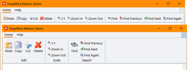
Simplified Ribbon Control in C1 Studio for WPF.Adds Simplified Ribbon contol, new FlexGrid101 Samples, customized icons, plus updates to Scheduler.
Features
- Simplified WPF Ribbon - Improve the look and navigation of your WPF apps with the modern, minimalistic simplified ribbon. This new control occupies the middle ground between a ribbon a toolbar, providing a single-line collapsed state, or a three-line ribbon-like appearance, and its design is influenced by Microsoft's ever-evolving Office 365 ribbon. You can customize the style of the ribbon, as well as the buttons you'd like to include.
- FlexGrid101 Samples - Added a new C1Icon that enables a new level of customization for the sort, filter, and grouping glyphs, as well as FlexGrid101 samples to make it even easier to get started with this popular control. They demonstrate features like selection, cell customization, conditional formatting, filtering, the RowDetails feature, cell merging, and many other points of interest.
- C1Icon - A new object that is used within the FlexGrid to make it much easier to customize the many icons used throughout for sorting, filter, etc. C1Icon allows you to specify your own image, font character, or use a built-in template to change the appearance of the icons found in the data grid.
- Scheduler Updates:
- New TableView Scheduler sample displays appointments in a table view that can be grouped, sorted, or filtered as specified by the developer or end user. It's similar to the Outlook 2016 List and Active views:
- AgendaView displays appointments grouped by date in a table view where a single table row represents a single appointment. Users can edit appointments by double-clicking on an appointment and opening the EditAppointment dialog. This view is always sorted by dates in ascending order, and doesn't have row or column headers.
- New "Working Elsewhere" appointment availability status has been added.
- FlexChart Updates:
- Animations - FlexChart and Finanical Chart now has animations for loading, updating, and changes to the chart axes. You can also create your own custom animations using the AnimationTransform event.
- Scale Breaks - FlexChart has also been updated to support axis scale breaks. Scale breaks can make irregular data that varies by a large magnitude easier to read as it makes the lower end of the scale more visible.
- Ranged drawing mode - allows support for built-in floating bar and Gantt charts. Ranged drawing mode is available for Bar, Column, and Area Charts.
- UWP controls are now available through NuGet.
↧
November 21, 2018, 7:06 am
ComponentOne Studio UWP FlexChartsNew animations for FlexChart and Financial Chart, plus ranged drawing mode for Bar, Column and Area Charts.
Features
- Simplified WPF Ribbon - Improve the look and navigation of your WPF apps with the modern, minimalistic simplified ribbon. This new control occupies the middle ground between a ribbon a toolbar, providing a single-line collapsed state, or a three-line ribbon-like appearance, and its design is influenced by Microsoft's ever-evolving Office 365 ribbon. You can customize the style of the ribbon, as well as the buttons you'd like to include.
- FlexGrid101 Samples - Added a new C1Icon that enables a new level of customization for the sort, filter, and grouping glyphs, as well as FlexGrid101 samples to make it even easier to get started with this popular control. They demonstrate features like selection, cell customization, conditional formatting, filtering, the RowDetails feature, cell merging, and many other points of interest.
- C1Icon - A new object that is used within the FlexGrid to make it much easier to customize the many icons used throughout for sorting, filter, etc. C1Icon allows you to specify your own image, font character, or use a built-in template to change the appearance of the icons found in the data grid.
- Scheduler Updates:
- New TableView Scheduler sample displays appointments in a table view that can be grouped, sorted, or filtered as specified by the developer or end user. It's similar to the Outlook 2016 List and Active views:
- AgendaView displays appointments grouped by date in a table view where a single table row represents a single appointment. Users can edit appointments by double-clicking on an appointment and opening the EditAppointment dialog. This view is always sorted by dates in ascending order, and doesn't have row or column headers.
- New "Working Elsewhere" appointment availability status has been added.
- FlexChart Updates:
- Animations - FlexChart and Finanical Chart now has animations for loading, updating, and changes to the chart axes. You can also create your own custom animations using the AnimationTransform event.
- Scale Breaks - FlexChart has also been updated to support axis scale breaks. Scale breaks can make irregular data that varies by a large magnitude easier to read as it makes the lower end of the scale more visible.
- Ranged drawing mode - allows support for built-in floating bar and Gantt charts. Ranged drawing mode is available for Bar, Column, and Area Charts.
- UWP controls are now available through NuGet.
↧
November 21, 2018, 7:07 am
Material Theme Designer and ASP.NET MVC Control Wizard.New WinForms Material Theme Designer, Simplified Ribbon contol for WPF and Control Wizard for ASP.NET MVC.
Features
Updates in WinForms
- New Material Theme Designer - In addition to adding Material, Material Dark, and Office 2016 Excel Green themes, WinForms now features a Material Theme Designer sample that allows you to set the primary and accent colours of Material theme and save\load them in C1themes format.
- New DataFilter control (beta) - A powerful UI addition, the DataFilter provides an easy, ecommerce-like filter to accompany any data-aware control. You can create filters from datasources, autogenerated, or create them manually. The accordion-based filtering UI can be attached to any control sharing a datasource or plugged into an info screen. The DataFilter is in beta mode and will be launched in 2019 v1.
- New Sparkline control and FlexGrid integration - This lightweight sparkline chart control represents the general shape of data variation in a condensed visual. It's often embedded in grids, and as such, FlexGrid can now display sparklines in columns, and it's now easier to plot trends inside FlexGrid cells. The sparkline property of the FlexGrid column supports plotting line, column, and WinLoss sparklines. You can further customize these sparklines by setting the Axis, markers, and series colours among others.
- FlexGrid now supports SortInfo and GroupInfo, so column information can now be saved and loaded.
- Scheduler's table and agenda views are now launched and out of beta.
- FlexChart now supports animation when loading, updating, and adding new data.
Updates in WPF and UWP
- Simplified WPF Ribbon - Improve the look and navigation of your WPF apps with the modern, minimalistic simplified ribbon. This new control occupies the middle ground between a ribbon a toolbar, providing a single-line collapsed state, or a three-line ribbon-like appearance, and its design is influenced by Microsoft's ever-evolving Office 365 ribbon. You can customize the style of the ribbon, as well as the buttons you'd like to include.
- FlexGrid101 Samples - Added a new C1Icon that enables a new level of customization for the sort, filter, and grouping glyphs, as well as FlexGrid101 samples to make it even easier to get started with this popular control. They demonstrate features like selection, cell customization, conditional formatting, filtering, the RowDetails feature, cell merging, and many other points of interest.
- C1Icon - A new object that is used within the FlexGrid to make it much easier to customize the many icons used throughout for sorting, filter, etc. C1Icon allows you to specify your own image, font character, or use a built-in template to change the appearance of the icons found in the data grid.
- Scheduler Updates:
- New TableView Scheduler sample displays appointments in a table view that can be grouped, sorted, or filtered as specified by the developer or end user. It's similar to the Outlook 2016 List and Active views:
- AgendaView displays appointments grouped by date in a table view where a single table row represents a single appointment. Users can edit appointments by double-clicking on an appointment and opening the EditAppointment dialog. This view is always sorted by dates in ascending order, and doesn't have row or column headers.
- New "Working Elsewhere" appointment availability status has been added.
- FlexChart Updates:
- Animations - FlexChart and Finanical Chart now has animations for loading, updating, and changes to the chart axes. You can also create your own custom animations using the AnimationTransform event.
- Scale Breaks - FlexChart has also been updated to support axis scale breaks. Scale breaks can make irregular data that varies by a large magnitude easier to read as it makes the lower end of the scale more visible.
- Ranged drawing mode - allows support for built-in floating bar and Gantt charts. Ranged drawing mode is available for Bar, Column, and Area Charts.
- UWP controls are now available through NuGet.
Updates in ASP.NET MVC
- New Control Designer for ASP.NET MVC - With the newly-enhanced scaffolders, you can use the control wizard to configure controls when you're not using Entity Framework and generate code for a C1 MVC control. In addition to inserting a new control, this now supports updating an existing control definition using the wizard. This wizard can be invoked through the context menu or through Quick Actions in Razor view. This feature is supported in ASP.NET MVC and ASP.NET Core MVC.
- New Flight Statistics Sample - This dashboard-style sample displays flight performance data over time. Controls include FlexGrid with sparkline columns for delay trend and KPI columns. A treemap, bar chart, and line symbol chart are used in to display region-wide statistics, and users can drill down to a specific region and city by selecting the data points. On clicking a region in the Total Flights TreeMap, the FlexGrid displays the details of that region.
- Group items in ComboBox - From the user request folder! With CollectionView already supporting grouping, ComboBox grouping could be implemented with some custom code, but we added this as a simple property in the control itself:
- ActiveReports added to FlexViewer - In addition to FlexViewer's support for ActiveReports, a new Item Template allows you to quickly configure the viewer in your ASP.NET MVC app.
- DashboardDemo updated with Material Design - The DashboardDemo has been updated to include Material Design principles and color schemes. In addition, the DashboardLayout control has been added to the dashboard and analysis tabs.
- FlexGrid Enhancements:
- Use ColumnGroupProvider to create multi-level merged-cell column headers for groups of related columns.
- FlexGrid AccessibilityExtender can be used to easily extend accessibility support in one of two ways; Resize columns using the keyboard (alt+left/right keys). Provide an "alert" method that changes the content of an invisible element with the role "alert." This allows assistive tools to announce grid actions like sorting and filtering.
↧
↧
November 21, 2018, 7:08 am
ComponentOne UltimateNew Simplified Ribbon for WPF, Control Wizard for ASP.NET MVC, plus updates to WinForms and UWP controls.
Features
Updates in WinForms
- New Material Theme Designer - In addition to adding Material, Material Dark, and Office 2016 Excel Green themes, WinForms now features a Material Theme Designer sample that allows you to set the primary and accent colours of Material theme and save\load them in C1themes format.
- New DataFilter control (beta) - A powerful UI addition, the DataFilter provides an easy, ecommerce-like filter to accompany any data-aware control. You can create filters from datasources, autogenerated, or create them manually. The accordion-based filtering UI can be attached to any control sharing a datasource or plugged into an info screen. The DataFilter is in beta mode and will be launched in 2019 v1.
- New Sparkline control and FlexGrid integration - This lightweight sparkline chart control represents the general shape of data variation in a condensed visual. It's often embedded in grids, and as such, FlexGrid can now display sparklines in columns, and it's now easier to plot trends inside FlexGrid cells. The sparkline property of the FlexGrid column supports plotting line, column, and WinLoss sparklines. You can further customize these sparklines by setting the Axis, markers, and series colours among others.
- FlexGrid now supports SortInfo and GroupInfo, so column information can now be saved and loaded.
- Scheduler's table and agenda views are now launched and out of beta.
- FlexChart now supports animation when loading, updating, and adding new data.
Updates in WPF and UWP
- Simplified WPF Ribbon - Improve the look and navigation of your WPF apps with the modern, minimalistic simplified ribbon. This new control occupies the middle ground between a ribbon a toolbar, providing a single-line collapsed state, or a three-line ribbon-like appearance, and its design is influenced by Microsoft's ever-evolving Office 365 ribbon. You can customize the style of the ribbon, as well as the buttons you'd like to include.
- FlexGrid101 Samples - Added a new C1Icon that enables a new level of customization for the sort, filter, and grouping glyphs, as well as FlexGrid101 samples to make it even easier to get started with this popular control. They demonstrate features like selection, cell customization, conditional formatting, filtering, the RowDetails feature, cell merging, and many other points of interest.
- C1Icon - A new object that is used within the FlexGrid to make it much easier to customize the many icons used throughout for sorting, filter, etc. C1Icon allows you to specify your own image, font character, or use a built-in template to change the appearance of the icons found in the data grid.
- Scheduler Updates:
- New TableView Scheduler sample displays appointments in a table view that can be grouped, sorted, or filtered as specified by the developer or end user. It's similar to the Outlook 2016 List and Active views:
- AgendaView displays appointments grouped by date in a table view where a single table row represents a single appointment. Users can edit appointments by double-clicking on an appointment and opening the EditAppointment dialog. This view is always sorted by dates in ascending order, and doesn't have row or column headers.
- New "Working Elsewhere" appointment availability status has been added.
- FlexChart Updates:
- Animations - FlexChart and Finanical Chart now has animations for loading, updating, and changes to the chart axes. You can also create your own custom animations using the AnimationTransform event.
- Scale Breaks - FlexChart has also been updated to support axis scale breaks. Scale breaks can make irregular data that varies by a large magnitude easier to read as it makes the lower end of the scale more visible.
- Ranged drawing mode - allows support for built-in floating bar and Gantt charts. Ranged drawing mode is available for Bar, Column, and Area Charts.
- UWP controls are now available through NuGet.
Updates in ASP.NET MVC
- New Control Designer for ASP.NET MVC - With the newly-enhanced scaffolders, you can use the control wizard to configure controls when you're not using Entity Framework and generate code for a C1 MVC control. In addition to inserting a new control, this now supports updating an existing control definition using the wizard. This wizard can be invoked through the context menu or through Quick Actions in Razor view. This feature is supported in ASP.NET MVC and ASP.NET Core MVC.
- New Flight Statistics Sample - This dashboard-style sample displays flight performance data over time. Controls include FlexGrid with sparkline columns for delay trend and KPI columns. A treemap, bar chart, and line symbol chart are used in to display region-wide statistics, and users can drill down to a specific region and city by selecting the data points. On clicking a region in the Total Flights TreeMap, the FlexGrid displays the details of that region.
- Group items in ComboBox - From the user request folder! With CollectionView already supporting grouping, ComboBox grouping could be implemented with some custom code, but we added this as a simple property in the control itself:
- ActiveReports added to FlexViewer - In addition to FlexViewer's support for ActiveReports, a new Item Template allows you to quickly configure the viewer in your ASP.NET MVC app.
- DashboardDemo updated with Material Design - The DashboardDemo has been updated to include Material Design principles and color schemes. In addition, the DashboardLayout control has been added to the dashboard and analysis tabs.
- FlexGrid Enhancements:
- Use ColumnGroupProvider to create multi-level merged-cell column headers for groups of related columns.
- FlexGrid AccessibilityExtender can be used to easily extend accessibility support in one of two ways; Resize columns using the keyboard (alt+left/right keys). Provide an "alert" method that changes the content of an invisible element with the role "alert." This allows assistive tools to announce grid actions like sorting and filtering.
↧
November 28, 2018, 2:39 am
Aspose.Tasks for JavaAdds support for JDK 11.
Features
- Adds support for Java Development Kit (JDK) 11.
Fixes
- Project Reading Exception.
- Incorrect time phased data in output MSP file.
- Incorrect duration of summary tasks with two assignments.
- Incorrect calculation of time phased data in particular cases.
- Summary tasks have an incorrect duration in particular cases.
- ResourceFlag4 isn't read correctly.
- Tasks guides are imported incorrectly from Primavera DB.
- Calendars are imported incorrectly from Primavera DB.
- Removes a set of actual fields while assigning a resource.
↧
December 12, 2018, 3:28 am
Aspose.Tasks for .NETCustomize the styles of custom fields.
Features
- Added the ability to customize the styles of custom fields.
- Added support for .NET Standard 2.0.
↧
December 13, 2018, 4:23 am
Highcharts GanttAdds Typescript support, plus new annotation API for supporting user interaction.
Features
- Typescript support:
- Highcharts NPM package now allows type checking for most Highcharts options and functions, including auto-complete code with integrated documentation for TypeScript-capable editors like Visual Studio Code.
- Annotation API for supporting user interaction:
- Build user-interfaces for client-side annotation, via the API. Offered as a turnkey solution that includes commonly used annotations, such as text labels, shapes, arrows, and flags, it is also easily extended with your own annotations.
- Client-side editing of charts makes it easy for non-developers to enhance their charts for more engaging storytelling. Allows end users to write text, draw arrows and symbols, ideal for all kinds of publishers, scientists or analysts.
- New, interactive Highcharts Debugger helps speed up development by providing instantaneous warnings and error reports above your charts. The error messages provide clear instructions on how to resolve your issue.
- New chart types:
- Venn diagram.
- Euler diagram.
- Packed Bubble charts.
- Depth Chart (aka. Wall Chart).
- Pyramid Column.
- 3D Cylinder.
- Force-Directed graphs (aka. Network Graph).
- Enhanced accessibility module with a sonification API for rendering data series into audio frequencies.
- Improved label positioning options in pie charts.
- Improved legend representation of bubble charts.
- Improved chart styling with CSS (aka. styled mode) will now be activated through options on a chart-by-chart basis, instead of as a separate library.
↧
↧
December 14, 2018, 6:18 am
Telerik DevCraft UltimateTelerik Reporting Upgrade Wizard now handles projects that use Telerik Reporting NuGet packages.
Features
Updates in Telerik Reporting R3 2018 SP2
- Upgrade Wizard now handles projects that use Telerik Reporting NuGet packages.
Fixes
Fixes in Telerik Reporting R3 2018 SP2
- Designers
- An error occurs when adding new HtmlTextBox into a Table item
- Barcode item shows an error when a conditional formatting rule is applied
- Conditional Formatting rule setting "Stop If True" gets ignored by the dedicated editor dialog
- Graph wizard adds label connectors
- Table item adds parent group in a wrong group hierarchy level
- Standalone Report Designer
- Aliases in Query Designer are generated with quotes, which breaks the Oracle query with 'ORA-00923: FROM keyword not found where expected'
- Filters in Query Designer are not generating the correct SQL for Oracle. Preceding (:) is missing
- Visual Studio Designer
- An error occurs when adding new report using a New Item Template
- New Item/project template errors when the default editor is a the code editor
- Upgrade Wizard fails to change the HTML5 Report Viewer file references
- Processing
- An error is thrown when processing Table item with merged cells
- DataSource's calculated columns are evaluated incorrectly
- Graph's numerical scale does not produce a label for each major grid line
- WebAPI
- Authentication token is missing from the request header for searching in report contents
- HTML5 Report Viewer
- Cannot change the reportSource of the viewer on page postback when the viewer's PersistSession is True
- CSS selector from fonticons.css breaks the Kendo icons with FontAwesome and k-icon class
- History is not working correctly after postback if the current reportSource contains datetime parameter
- Missing box-sizing style breaks the styling of reports containing a Table item
- Missing icons in document map area
- Nullable MultiValue Parameter with Value NULL generates array with one element
- The Preview button does not change the reportSource preserved in the browser session when using persistSession=true
Fixes in Telerik Report Server R3 2018 SP2
- Designer
- An error occurs when adding new HtmlTextBox into a Table item.
- Barcode item shows an error when a conditional formatting rule is applied.
- Conditional Formatting rule setting "Stop If True" gets ignored by the dedicated editor dialog.
- Graph wizard adds label connectors.
- Table item adds parent group in a wrong group hierarchy level.
- Aliases in Query Designer are generated with quotes, which breaks the Oracle query with 'ORA-00923: FROM keyword not found where expected'.
- Filters in Query Designer are not generating the correct SQL for Oracle. Preceding (:) is missing.
- Processing
- An error is thrown when processing Table item with merged cells.
- DataSource's calculated columns are evaluated incorrectly.
- Graph's numerical scale does not produce a label for each major grid line.
- REST WebAPI
- Authentication token is missing from the request header for searching in report contents.
- Preview
- Missing icons in document map area.
- Nullable MultiValue Parameter with Value NULL generates array with one element.
- The Preview button does not change the reportSource preserved in the browser session when using persistSession=true.
↧
December 14, 2018, 6:18 am
Telerik DevCraft CompleteTelerik Reporting Upgrade Wizard now handles projects that use Telerik Reporting NuGet packages.
Features
Updates in Telerik Reporting R3 2018 SP2
- Upgrade Wizard now handles projects that use Telerik Reporting NuGet packages.
Fixes
Fixes in Telerik Reporting R3 2018 SP2
- Designers
- An error occurs when adding new HtmlTextBox into a Table item
- Barcode item shows an error when a conditional formatting rule is applied
- Conditional Formatting rule setting "Stop If True" gets ignored by the dedicated editor dialog
- Graph wizard adds label connectors
- Table item adds parent group in a wrong group hierarchy level
- Standalone Report Designer
- Aliases in Query Designer are generated with quotes, which breaks the Oracle query with 'ORA-00923: FROM keyword not found where expected'
- Filters in Query Designer are not generating the correct SQL for Oracle. Preceding (:) is missing
- Visual Studio Designer
- An error occurs when adding new report using a New Item Template
- New Item/project template errors when the default editor is a the code editor
- Upgrade Wizard fails to change the HTML5 Report Viewer file references
- Processing
- An error is thrown when processing Table item with merged cells
- DataSource's calculated columns are evaluated incorrectly
- Graph's numerical scale does not produce a label for each major grid line
- WebAPI
- Authentication token is missing from the request header for searching in report contents
- HTML5 Report Viewer
- Cannot change the reportSource of the viewer on page postback when the viewer's PersistSession is True
- CSS selector from fonticons.css breaks the Kendo icons with FontAwesome and k-icon class
- History is not working correctly after postback if the current reportSource contains datetime parameter
- Missing box-sizing style breaks the styling of reports containing a Table item
- Missing icons in document map area
- Nullable MultiValue Parameter with Value NULL generates array with one element
- The Preview button does not change the reportSource preserved in the browser session when using persistSession=true
↧
December 18, 2018, 6:56 am
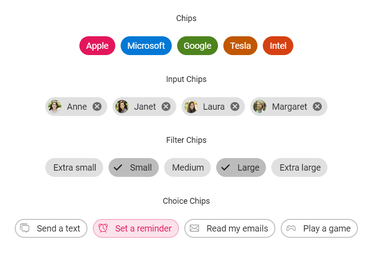
New Chip controlAdds new Chip, In-place Editor and PDF Viewer components.
Features
New Components
- Chip - The Chip control contains a small block of essential information that triggers an event on click action. It also contains the primary text, image, or both, and is mostly used in mail, contacts, or filter tags.
- Input chip - Basic chip with a delete icon that represents a person or entity and enables the removal of chips from the chip list collection.
- Choice chip - Used to select an option from those available.
- Filter chip - Used to select multiple options from those available.
- In-place Editor - The In-place Editor control is used to edit an element in place with inline and pop-up modes. The control has built-in support to handle all form controls such as text box, drop-down list, date picker, and rich text editor.
- PDF Viewer - The PDF Viewer component enables you to view and print PDF files:
- Both normal and PDF files protected with AES and RC4 encryption can be opened and displayed.
- Core interactions are included: scrolling, zooming, panning, and page navigation.
- Built-in toolbar.
- Select and copy text from PDF files.
- Text can be easily searched for across the PDF document.
- Easy navigation with the help of bookmarks, thumbnails, hyperlinks, and a table of contents.
- Two view modes are available: fit-to-page and fit-to-width.
- The entire document or a specific page can be printed directly from the browser.
- Query Builder - The Query Builder component is a graphical user interface that allows you to create and edit filters. It outputs a structured JSON of filters that can be easily parsed to create SQL. The control is integrated with Data Manager to communicate with a data source and returns the desired results based on the provided filter. It supports data binding, templates, and horizontal and vertical orientation.
- Splitter - The Splitter component is a layout user interface (UI) control that has resizable split panes. The container splits into multiple panes that can be oriented horizontally or vertically. The separator (divider) splits the panes and is used to resize panes. Place the Splitter control inside a split pane to make a nested layout user interface.
- TreeGrid - The Essential Studio ASP.NET Core TreeGrid is a feature-rich control used to visualize self-referential hierarchical data effectively in a tabular format. Its rich feature set includes many functionalities: data binding, editing, sorting, filtering, grouping, paging, aggregating rows, and exporting to Excel, CSV, and PDF formats.
- StockChart - The StockChart is a feature-rich control used to track and visualize the stock price of any company for a specific period using charting and range tools. Its rich feature set includes many functionalities: data binding, tooltip, crosshair, zooming, panning, and exporting to image and PDF formats. All stock elements are rendered by using Scalable Vector Graphics (SVG).
- Preview to production - The following components have been moved from preview to production in Essential JS 2 for ASP.NET Core:
- Diagram
- Word Processor
- Menu Bar
- Pivot Table
- Progress Button
- Rich Text Editor
Calendar
- Islamic Calendar - In addition to the Gregorian calendar, the Calendar control supports displaying the Islamic calendar (Hijri calendar).
- Chart
- Lazy loading - Load a chart with data on demand.
- Pie radius - Pie chart now supports different radii for each slice.
- Pie center - Change the center of the pie.
- Gridline and axis label animation - Chart now supports gridline and axis label animation on legend click.
Circular Gauge
- Radius calculation based on start and end angles - The radius of the circular gauge will be calculated based on the start and end angles to avoid excess white space while rendering semi or quarter circular gauge.
Diagram
- UML Class Diagram - This feature allows users to create a UML class diagram through code or a visual interface with the built-in class diagram shapes.
- UML activity diagram - This feature allows users to create a UML activity diagram through code or a visual interface with the built-in activity shapes.
- Drag limit support for connector’s annotations - This feature allows users to limit the label positions while dragging a label from the connector.
- CRUD - This feature allows the users to generate a diagram by reading the data from the database, and updating the database with the newly inserted/updated/deleted nodes and connectors.
- Virtualization - This feature allows users to render a large number of nodes and connectors in a diagram for effective performance.
Dialog
- Resizable dialog - Resize modal and non-modal (modeless) dialogs. The dimensions of a dialog can be adjusted dynamically using this feature.
Essential DocIO
- Update field enhancements - Essential DocIO now allows updating the AutoNum and Set fields in a Word document.
- Restart numbering in lists - Essential DocIO now allows numbering in lists to be restarted in the Word documents while performing mail merge and merging multiple Word documents.
- Hyphenation in Word-to-PDF and Word-to-image conversions - Essential DocIO now allows hyphenating text in a Word document while converting it to PDF or image format.
- Track changes in Word-to-PDF conversion - Essential DocIO now allows showing revision marks in a generated PDF when converting Word documents with tracked changes or revisions.
- Word-to-PDF enhancements - Essential DocIO now provides the following features in Word-to-PDF conversion:
- 30% improvement in conversion performance.
- Improvements in text size calculation to paginate Word documents properly.
- Preservation of rotated images.
- Option to embed complete or subset font information for TrueType fonts.
- PDF conformance level PDF/A1B or PDF/X-1a:2001 for long-term archiving.
- Preservation of complex script text.
DocumentEditor
- Right to left - The DocumentEditor now supports right to left flow direction for all UI elements like the find and replace pane, dialogs, and more.
- IME support - The DocumentEditor now supports input method editor (IME) that allows entering complex languages like Japanese, Chinese, etc.
File Upload
- Sequential upload - The File Upload control processes files sequentially from the queue instead of trying to upload all the files at once.
Grid
- Row drag and drop - Drag and drop grid rows within the Grid to change row positions dynamically in the UI.
- Row spanning - This feature allows the user to span adjacent rows using grid events.
- Printing hierarchy - Print ‘n’ levels of child grids.
- Exporting grid hierarchy to Excel, CSV, and PDF - Export ‘n’ levels of child grids to Excel, CSV, and PDF formats.
- Add new row - Add a new row at the bottom of a grid in the UI.
Heatmap Chart
- Axis label grouping - Group multilevel axis labels in heatmaps.
- Legend selection - Toggle cell visibility in heatmaps by selecting legend items in the legend.
- Cell selection - Select a single cell or multiple cells using mouse interactions in heatmaps.
Maps
- Color mapping enhancements - Now, apply desaturation color mapping for the shapes in Maps along with gradient colors for legend items.
- Legend enhancements - It is possible to display only the desired legend items for color mapping and to bind legend text from the data source.
- Selection and highlight - Select or highlight the legend items similar to the shapes in Maps.
Essential PDF
- OpenType font - Add text to a PDF document using OpenType font.
- PDF/A-1b conformance - Create a PDF/A-1b conforming document.
Pivot Grid
- Editing and updating - End users can edit raw items at runtime, simultaneously updating the control.
- Drill-through - Provides support to easily obtain the list of raw items for a particular value cell or summary cell.
- Filter dialog - In the filter dialog, provided support to set limit display field values and search options to work with large data without any performance constraint.
Editor Paging
- Hyperlink - Allows users to retrieve information about a particular cell on hyperlink cell click. It also allows users to perform custom operations programmatically.
- Defer update - End users can refresh the control on-demand and not during every UI interaction.
- Show/hide totals - Provided support to show or hide subtotals and grand totals for rows and columns.
- Aggregations - More aggregation types like distinct count, product, index, population stdev, sample stdev, population var, sample var, running totals, difference from, % of difference from, % of grand total, % of column total, % of row total, % of parent total, % of parent column total, and % of parent column total have been added.
Essential Presentation
- Connector - Add, edit, and remove connectors in PowerPoint files.
Rich Text Editor
- Markdown table - This feature allows users to add tables with rows and columns in the Markdown editor.
Schedule
- Context menu - Context menu can be used with Scheduler now, which opens when the cells or appointments are right-clicked.
- Block time intervals - A specific time range can be blocked to prevent the creation of appointments in that time slot.
- External drag and drop - Drag and drop appointments from Scheduler to external sources and vice versa.
- Read-only events - Specific events can be made read-only on Scheduler, restricting any CRUD actions.
- Virtual scrolling - Load resources and appointments of timeline views virtually on every scroll action.
- Improvements on drag action - You can drag appointments on mobile devices using the tapHold event. Made improvements to achieve smooth scrolling and auto-navigation across a date range while dragging appointments to the extremities.
Tab
- Vertical Tab - Provided vertical orientation support in the Tab control, which arranges tab items from top to bottom. The header is positioned at the left or right edges of the Tab control.
TreeMap
- Color mapping enhancements - Now, apply desaturation color mapping for the items in TreeMap along with gradient colors for legend items.
- Legend enhancements - It is possible to display only the desired legend items for color mapping and to bind legend text from the data source.
- Selection and highlight - Select or highlight the legend items similar to the items in TreeMap.
TreeView
- AutoCheck - Provided an option to prevent automatic check/uncheck of the TreeView parent and child checkboxes. Now, each checkbox will act independently.
- Hierarchical data type support in remote data source - Now, you can use hierarchical data from remote services in the TreeView control.
- Load on demand - Provided an option to disable the load-on-demand support in TreeView control.
↧
December 18, 2018, 8:03 am
Visual Studio-like document interfaceAdds Visual Studio-like document interface to Docking Manager.
Features
Common
- High DPI support - High-DPI support has been provided for the following Windows Forms controls to preserve the app quality on high-DPI devices:
- SpreadSheet
- DomainUpDownExt
- NumericUpDownExt
- Calculator
- Rating
- RadialGauge
- LinearGauge
DataGrid
- Paging - The new Data Pager control is being introduced to manipulate data. Users can navigate to a part of the data from an underlying data source with on-demand data loading support.
- Performance improvement - Improved summary calculation for group summaries and caption summaries by calculating summaries for columns on demand. DataGrid will load and scroll much faster when a summary is added for more than 300 columns.
- Autofit group drop area item - Autofit the grouped items in the group drop area based on their text. This allows end users to view all the grouped items’ text.
- Does Not Contain option in filtering - DataGrid supports a Does Not Contain option for both UI and programmatic filtering. Now, users can filter records that do not contain a given value. Windows Forms DataGrid Does Not Contain feature.
- Improvements
- Customize the Excel-like selection of marker colors in the row header.
- Customize the outermost border color of a grid.
ComboBox
- Custom filtering for suggestions - Display a custom suggestion list in the drop-down on typing text in the editor portion. Thus, end users can show a custom suggestion list such as one with Fuzzy logic to tolerate typo errors.
ListView
- Outermost border customization - Customize the outermost border color of ListView control.
Chart
- Rotate axis title - Rotate the chart axis title to the desired angle to improve readability.
- Save chart without toolbar - Copy and save a chart as an image with or without a toolbar.
- Options for saving chart as a template - Include or exclude series data points and series styles when saving the chart as a template.
Essential DocIO
- Update field enhancements - Essential DocIO now allows updating the AutoNum and Set fields in a Word document.
- Restart numbering in lists - Essential DocIO now allows numbering in lists to be restarted in the Word documents while performing mail merge and merging multiple Word documents.
- Hyphenation in Word-to-PDF and Word-to-image conversions - Essential DocIO now allows hyphenating text in a Word document while converting it to PDF or image format.
- Track changes in Word-to-PDF conversion - Essential DocIO now allows showing revision marks in a generated PDF when converting Word documents with tracked changes or revisions.
- Word-to-PDF enhancements - Essential DocIO now provides the following features in Word-to-PDF conversion:
- Preservation of complex script text.
Docking Manager
- Tabbed documents - A Visual Studio-like document interface has been added to the Docking Manager. It allows users to drag and drop tools windows to a document state. Document windows can be grouped to split the workspace and allow users to work with two or more open documents.
Essential PDF
- OpenType font - Add text to a PDF document using OpenType font.
- Get certificate details from PDF - Get certificate details from an existing signed PDF document.
Essential Presentation
- Connector - Add, edit, and remove connectors in PowerPoint files.
Ribbon
- Auto Layout - Controls in Ribbon can be arranged without additional settings like margin, padding, or any customization, similar to Office UI. Designer process has been made easy for configuring the control.
Syntax Editor
- Zoom capability - Zoom-in and zoom-out capabilities help improve the readability of text in the Syntax Editor control. They allow users to zoom the text in the control through mouse-wheel and touch interaction.
↧
↧
December 18, 2018, 8:19 am
New JavaScript Query Builder componentAdds new StockChart, TreeGrid, PDF Viewer, Query Builder, Chip and Splitter JavaScript components.
Features
- ASP.NET Core
- New TreeGrid, PDF Viewer, in-place editor, query builder, Chip, and Splitter components included.
- Final version of Pivot Table, Document Editor, and Diagram.
- Row drag-and-drop in the Grid control.
- ASP.NET MVC
- New TreeGrid, PDF Viewer, in-place editor, query builder, Chip, and Splitter components included.
- Final version of Pivot Table, Document Editor, and Diagram.
- Enhanced user experience by including Visual Studio Scaffolding templates for Grid, Chart, and Schedule.
- Angular
- New StockChart, TreeGrid, PDF Viewer, in-place editor, query builder, Chip, and Splitter components included.
- Final version of Pivot Table, Document Editor, Diagram.
- Included built-in shapes for UML class and UML activity diagrams.
- React
- New StockChart, TreeGrid, PDF Viewer, in-place editor, query builder, Chip, and Splitter components included.
- Final version of Pivot Table, Document Editor, and Diagram.
- Load large data in Schedule without losing any performance using the Schedule Virtualization feature.
- Vue
- New StockChart, TreeGrid, PDF Viewer, in-place editor, query builder, Chip, and Splitter components included.
- Final version of Pivot Table, Document Editor, and Diagram.
- Users can edit and save data at runtime in Pivot Grid.
- JavaScript
- New StockChart, TreeGrid, PDF Viewer, in-place editor, query builder, Chip, and Splitter components included.
- Final version of Pivot Table, Document Editor, and Diagram.
- Lazy loading: Chart can load data on demand.
- Xamarin.Forms
- New Button, Border, Backdrop, Chips, BadgeView, and ParallaxView controls included.
- Now you can theme all controls using predefined dynamic resource keys.
- Included form-filling and editing support in PDF Viewer.
- Xamarin.iOS
- Included current cell support for DataGrid.
- Series selection support has been provided for Chart.
- Support for validation message customization has been provided for DataForm.
- Xamarin.Android
- Included current cell support for DataGrid.
- Series selection support has been provided for Chart.
- Support for validation message customization has been provided for DataForm.
- WinForms
- New Data Pager control is included.
- Tabbed document interface feature has been added to the Docking Manager.
- Changes can be tracked in Word-to-PDF conversions.
- WPF
- New System theme support has been provided for all WPF controls.
- PDF Viewer now has support for page organization, redaction, stamp annotation, and handwritten signature.
- Changes can be tracked in Word-to-PDF conversions.
- UWP
- Included stacked doughnut chart in UWP Chart.
- RichTextBox can embed UI elements within a document.
- Provided OpenType font support in UWP PDF Library.
- ASP.NET Web Forms
- Tablix report item support has been included in Report Designer.
- Included trend line chart support in Report Viewer.
- Changes can be tracked in Word-to-PDF conversions.
↧
↧
DevExpress UniversalComprehensive software development toolset for .NET and JavaScript. Latest maintenance release.
Fixes
DevExpress has released a maintenance update across their entire product range.
↧